I've found a useful infograph about Type Faces. Cliff Kuang of Factodesign.com created the easy to understand infrograph. Fonts are an important part of the Jaffe Center, and we contain many books about fonts, how to use them, how to make them, or artists' books that play with fonts. At the Center, we use a lot of fonts that are created by Eric Gill, such as Gill Sans and Perpetua, which are clear, balanced, and modern.
A favorite artists' book of mine is Eclectic Geometric, or Lunch with Nicolete by Russell Maret. The portfolio book contains 26 prints of the 26 letters rendered with a compass and straightedge. The designs of the letters are beautiful and Maret has drawn the circles that have influenced the design of the letters. To read more on the book, check out Judith Klau's review here.
Phillip Chapman-Bell is an origami artist hailing from Northampton, Massachusetts, "where the coffee is strong and so are the women," quoted from a Northampton parking garage sign. Chapman-Bell's origami focuses less on tessellations and is more inspired by towers, goblets, bowls, and flutes, but isn't wary of natural shapes like shells and flowers. He is a master with paper pleating, and likes to incorporate photographs and text in these pleats. A favorite of mine that he loaned to the Jaffe Center is a vase-shaped structure titled No, Not That One, where he incorporates a section of John Keats poem Ode on Melancholy into the piece.
Chapman-Bell has a wit and playfulness to him that is apparent in his work. He states, "I'm an origami designer and human resources drudge living in Massachusetts. Aside from origami, my interests include udon noodles, 18th century novels, regular expressions, neo-English verse and smiting Republicans with blunt objects and/or witty satire.
Threads
(Clarification: the last item refers to a John Hopkins stud which found that four out of five forensic pathologists could not distinguish my prose style from a croquet mallet. I can't say that I agree with their research method- logical regression, indeed-but what can one do? They're the ones with the DOD grant money)
And I probably should mention my deep and abiding enthusiasm for open source origami. Clever catchphrase du jour: It isn't origami until you share it."
No, Not That One
And sharing he does. Chapman-Bell has over 600 photos of his work on the origami site Curved Folding, and it's all fantastic. Also, check out his blog, The Fitful Flog.
Matt Shlian is one of the origami artists that have loaned their work to the JCBA for our Born from Folding exhibit. Of all the artists from the exhibit, Shlian is probably the most in tune with the rest of the Jaffe Center. While Shlian does create origami tessellations and sculptures, he also creates pieces that require manipulation by the user, much like a book. For those who have been to the JCBA, his work is reminiscent of the slinky book by Susan Joy Share. The amazing thing about these metamorphic pieces is that they are still made with one sheet of paper.
Shlian, like many of the artists in the exhibit, is a mathematician and artist, making him a modern renaissance man. He states, "as a paper engineer, my work is rooted in print media, book arts, and commercial design. Beginning with an initial fold, a single action causes a transfer of energy to subsequent folds, which ultimately manifest in drawings and three-dimensional forms.
I use my engineering skills to create kinetic sculpture, which has lead to collaborations with scientists at the University of Michigan. We work at a nanoscale, translating paper structures into micro folds. Our investigations extend to visualizing cellular division and solar cell development.
Researchers see paper engineering as a metaphor for scientific principles; I see their inquiry as a basis for artistic exploration. In my studio, I am collaborator, explorer, and scientist. I begin with a system of folding and at a particular moment, the materials take over. Guided by wonder, my work is made because I cannot visualize its final realization; in this way I come to understanding through curiosity."
Shlian loaned to the JCBA one of his most captivating pieces, Unlean Against Our Heart. The piece opens out into a ridged arch that folds in itself when the covers rotate. When have you even seen a sheet of paper rotate and pulsate at the same it.
Some of you may know that we installed a new exhibit focusing on origami titled Born from Folding: The Art and Science of Origami. The exhibit explores the use of geometric folds that are a part of our everyday lives. DNA, protein cells and sound waves are just some of the folding that occur in nature. An airbag is perfectly folded up to be contained in a small space yet still has the ability to be expanded in less than a second. We feel that these folds are symbolized in folding one sheet of flat paper. The exhibit looks into the the characteristics of folding by displaying origami art from various artist from around the world along with artists' books from the Jaffe Collection that feature various sciences like astrophysics and genetics.
One of the artist that loaned their pieces to the exhibit is Andrew Hudson. Along with being an origami artist, Hudson is also a music composer. He started folding during a year abroad at the age of 4 while his parents were teaching English in Japan. Born in 1990, he belongs to the youngest generation of origami artist, who have grown up native to the advancements in technique that transformed the art during the 1980s.
Elliptical Tato-Image by Andrew Hudson
"My work focuses on symmetries and shapes resulting from folding algorithms. For the past couple of years, I've been particularly interested in processes that repeat themselves-fractals, tessellations, and other patters- and the consequences they have for other branches of origami design." His other interests in the media include the exploration of different polygonal symmetries, process restrictions, and the history of origami.
Hudson will be here to teach a couple of workshops and give a gallery talk in January (information will come out more about that later.) You can view his blog to keep up with all of the work that he has created.
Crumpling a Thin Sheet (2007) is Rutherford Witthus' scientific publication paying homage to John Cage, who practiced chance-determination as a part of his art. Witthus was infatuated by a piece of paper that he crumpled up and threw away. After studying the paper and its crumples, Witthus went on to explore the crumples of various types of papers, and found that every paper and crumple had their own distinct, special quality.
Image by Rutherford Witthus
Witthus went on to photograph his crumpled creations and meticulously wrote down their construction. "Crumple 19. Crumpled for 20 seconds on 22 June 2007 at 09:43:02 AM." Witthus even goes so far to document Crumple 19's internal construction by bisecting and dissecting the paper. Witthus continues with his scientific investigation by reprinting a 2001 study by a group of physicists from the University of Chicago titled Crumpling a Thin Sheet. The group was composed of research assistants Rachel B. Wiliams and Kittiwit Matan, Dr. Thomas A. Witten, and Dr. Sidney R. Nagel. Dr. Nagel gets inspiration to take unusual studies because "many complex phenomena are so familiar that we hardly realize that they defy our normal intuition; we forget to ask whether or not they are understood." The study goes on to focus on how the sheet gets its strength and its size depending on the force that is applied to it.
Image by Rutherford Witthus
Of course, this is all Greek to me, but what stands out about the text is how Witthus highlights the text and enlarges it, sometimes overlapping the other text. These are statements that stand out to him that he found particularly interesting, for example, "sheets of different size were also used with no obvious change in result," or statements that gave the personified the sheets, like "relaxation continues to even if the compression is stopped." It's these changes in the words' sizes, font, and color, and Witthus' attractive black-and-white photographs, make this an aesthetically interesting book that will appeal to both artistic and scientific persuasions.
The book is housed in a wooden box with a photograph of Witthus crumpling a sheet. It is bound in a traditional sewn binding using twisted paper as support, which is a genius way of incorporating crumpled paper in the binding. It was printed on velin arches blanc paper using an Epson Stylus Pro 4000. There are 11 copies that were up for sale, 4 presentation copies, and the Jaffe Center has copy #6.
Image by Rutherford Witthus "Crumple 20. Crumpled for 9 seconds on 1 September 2007 at 14:09:31 PM."
Marv is a massive, imposing & heavily scarred man, which is why he is more than surprised by the fact that the mysterious & beautiful Goldie takes him home to bed. Marv is completely smitten with Goldie & can't believe his luck, but this quickly changes when Marv wakes up to find Goldie dead next to him & cops are already on their way. Marv knows that it is a set up & he isn't going down until he gets his revenge on Goldie's killer. "It's the old days. The bad days. The all-or-nothing days. They're back. There's no choices left & I'm ready for war," Marv states. He rampages through Basin City's underbelly & quickly learns that Goldie's killing has connections to some very prominent & important people.
Sin City: The Hard Goodbye is not a graphic novel for children. It's violence & sex is relentless. That being said, the violence & sex is extremely stylized & over-the-top. Written & drawn by Frank Miller, The Hard Goodbye could have been almost too much to handle if it had not been for his stark use of black & white. Many of the details get lost in the shadows, which is what makes this so aesthetically pleasing. The heavily shadowed & sharp illustrations give grit to the book & are reminiscent of film noirs.
Still, this is no The Maltese Falcon. Marv is perfect example of an anti-hero & his actions are absurd, which is why he may be Miller's greatest character to come out of the Sin City series. He is a savage, stubborn & easily angered & is a product of his urban environment. So, if you don't Marv, then you must not like the city.
This may be the best looking comic book store I've seen & I've seen my fair share of comic book stores. The store, called Tokyo's Tokyo, isn't big in size, but is creative in character, as the shelving is design like comic book panels. Each section is designed differently & some even contain word balloons. The display islands are even shaped as such. I don't know if it's even possible, but I would like to see them display their merchandise in some narrative order, like pages in a comic book (although, this is Japan, so you'd have to read it right side of the store to the left.) So, now I have a new destination to hit up when I go to Tokyo (which I hope is sooner than later.)
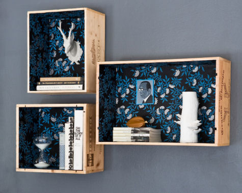
Do-it-yourself (DIY) work can be the funniest thing in the world & it can be the worst. Sometimes they turn out the way you thought & other time, not so much. I should know. This summer, I left assisting the Jaffe Center & working with primates at the Palm Beach Zoo to work on a houseboat in the Keys & let me tell you, it was a rough summer, but I got through it & I survived. But, I knew I wanted a special type of bookshelf for my special type of books. I normally have an old toaster by my bed where I keep the book that I'm currently reading, but I wanted something more me, because the regular bookshelf wasn't cutting it for me. I made shelves out of wooden pallets that I received from an order of shutters & they are amazing (part of DIY is patting yourself on the back.) So, I thought I'd share other DIY bookshelf ideas that I found on the inter-web to inspire your own special spot for your own special books. Now I'm searching for an old TV to hollow out.
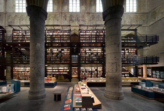
This may be the most beautiful bookstore in the world. It is the Selexyz Dominicanen Bookstore & it is located in Maastricht in the Netherlands. The cathedral is 800 years old & was converted in 2007 by architects Merkx & Girod, who were smart enough to keep with the cathedral's original design & floor plan. The alter became the store's cafe, which contains an amazing cross-shaped table. The cathedral hasn't been a place of worship for 200 year & get this; there are a large number of churches & cathedrals that are abandoned in the Netherlands. I hope to see more useful space to come out of these emptied masterpieces.
I don't know about anyone else, but I'm addicted to Game of Thrones. It took me a while to get into it, as the middle part of season 1 was murky for me & they were adding new characters left & right, it was starting to make my head spin. But, now I've been mentally trained & I'm able to keep the numerous plots in their place & I love it. My favorite is Arya, who was a just a tomboyish poppet at the beginning of the series, & is now a clever, resourceful girl, & Rob Stark, who had become Ned Stark's eldest son into the fearsome, capable King of the North.
I found this broadside printed by Christopher Harrell inspired by the Game of Thrones. On it is a wolf, the animal of Winterfell & it states "Winter is Coming," a common saying in the series, which is notable as to seasons in the Seven Kingdoms can last for 10 weeks or 10 years; there is no telling & the citizens of the Seven Kingdoms are expecting a long winter.
The Jaffe Center has a number of altered books. I enjoy them because it turns the book form into something sculptural. It makes the viewer realize that the book form is something to be admired, but also something that can be molded & shaped. The artists often play with the pages or text in creative, unusual ways. I found one artist, Guy Laramée, who has quite an impressive series of altered books that are inspired by mountain ranges & oceans. I have no idea how one can turn pages into looking like waves of water or textured cliffs, but Laramée has crafted an important allegory: the book is just as old as some ancient monuments & mountains.