Showing posts with label Center Paige. Show all posts

Thursday, March 22, 2012

Center Paige: Match in a Bottle

Match in a Bottle is a book of seven poems by Tracey Knapp & is illustrated by Kurt Gohde. The book is housed in a clamshell box & the box & the book are covered in Japanese red cloth. They both have a 22-karat gold foil stamp with the book's title on it. The seven poems are all about fire & smoke, and the seven illustrations that correspond with the poems are all made with smoke.

The smoke illustrations are all original "drawings" that are made with matches, kerosene lamps, "snaps", gunpowder & cigarette lighters. These illustrations are quite unique & intricate. It's hard to figure out how they were able to make these illustrations. One illustration looks like a black cauldron that is has smoke rising out of it, or there is an illustration of ghosts that is very eerie. There were 65 copies of this book made, meaning that there were a total of 455 illustrations that needed to be made, but I'm sure there were many experiments and failed attempts. Gohde refers to Jules Renard's quote about smoke as "the inconstant wife of the wind," probably out of his attempts to make smoke a constant.

The poetry is rich and fully descriptive. The first poem is short but is a good starting point as to the tone of the rest of the book:

Key


I am talking about fire
and that means burning.
About a lit match in a bottle.
About stirring up embers 
while walking through ruins.


Match in a Bottle is a beautiful book that shows off artistic skill, creativity & persistence & one of the most exhibited books here at the JCBA.

Thursday, February 16, 2012

Center Paige: Le Petit Chaperon Rouge

Le Petit Chaperon Rouge (Little Red Riding Hood) was created by the legendary illustrator, Warja Lavater. The book is accordion bound between maroon linen covered boards. It was created in 1965 & is executed in original color lithography. The first page features a key in French, German, English & Japanese that explains the symbols in the book. The red dot represents Little Red Riding Hood, the black dot represents the wolf, etc., and that is the only text in the book. The symbols tell the story.

Presenting a story with symbols makes the storytelling universal. Even if one doesn't speak the four languages in the key, if they know the story of Little Red Riding Hood then they would understand the book. The method makes for an artistic & dynamic recreation, particularly during the part of the story when the woodsman kills the wolf; the wolf explodes like lava shooting out of a volcano. The book can be unfolded & stretched out & viewed like one piece of art.

The book is an interesting study in semiotics & symbols. We, as a culture, know the story of Little Red Riding Hood & we see the symbols in the book & by elimination & combination, can flesh out the narrative. The symbols allow interpretation, giving the reader the chance to create their own dialogue & motivation.

Lavater created many books like this about fairy tales & there are a number of them here at the Center. These books were sold at gift shops in museums, like the Louvre, & they allowed people to have a little pieces of art in their hands for about $15. These books may have inspired many future art aficionados & collectors.

Thursday, December 22, 2011

Center Paige: Direction of the Road

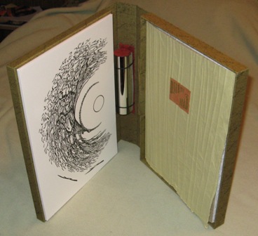
Direction of the Road is a favorite among JCBA fans & employees. Science fiction & fantasy writer Ursula Le Guin wrote the story & artist Aaron Johnson constructed the book, box & images. The book is made out of over-beaten homemade linen paper & bound together in a long stitch. The text is letterpress printed & paper leave are pasted on every page. The book is held in a portfolio box & on the inside of the box's cover is a woodcut image. On the inside of the spine of the box is a tube covered with reflective polymer.

The story follows the life of an oak tree that lives in a field by a road. It has solitary life by the road with the exception of the occasional squirrel or bird. The tree also has a job to fulfill. It must grow larger as things get closer to it & smaller as things get further away. The tree can even grow larger on one side & smaller on the other as things travel down the road & the tree can do it in its sleep. The tree gets use to people traveling on horses & wagons, but soon notices loud, horseless wagons more & more. One of these high-speed cars caused the oak to leap in front of the car, causing the tree to make the decision to kill the driver. The tree was not happy about the mortal decision it had to make, but the driver didn't follow the North-South rules of the road. The tree had to kill him, but it is not a job that oaks are made for.

The whole story not only takes an interesting perspective, that of a tree, but also the way the tree sees the world is interesting. The tree sees itself the way we would see a tree. The tree grows bigger & smaller, or the tree moves slowly or at sixty miles per hour, depending on your ride. We also see the changes in the tree's world that come from changes in ours. The air smells, birds that travel to the tree lessen, & the tree gains new jobs. It not only has to provide shade to travelers, homes to animals, but also kill those who don't follow the rules.

Aaron Johnson took the story's unique POV & incorporated it with book. For one, the over-beaten pages make a rustling noise, much like that of leaves blowing in the wind. The leaves pasted on the pages turn green to brown as the story goes on, conveying life transitioning to death. But the most surprising & creative aspect of the book is the woodcut inside the box, which looks like a warped image of indistinct lines surrounding a circle. If you place the reflective tube on the circle, you realize that the woodcut is actually a warped image of a tree that has to be viewed on the tube & details like birds & a man sitting under the tree become clear. It is an anamorphic image, anamorphic meaning "to transform" in Greek, & is an art form first experimented with by Leonardo di Vinci.


Everything about Direction of the Road, from the box to the story to the art to the paper, is to convey & reiterate Le Guin & Johnson's themes. That is why is a favorite here at the center & new audience members always get a kick out of this book.

Tuesday, November 22, 2011

Center Paige: A Line

A Line is a wood cut & linoleum cut story by Suyeon Kim about "a blind fisherman, his dog & the bond between them." The book was printed by Incline Press & bound in an accordion fold & features sixteen prints. Along with the book comes a simple signature pamphlet bound book with the colophon & the written narrative of the book.

The story follows a blind fisherman who uses a line to go out to sea & collect his nets, but a seagull steals the line. The fisherman's dog turns into a bird to take back the line, but as the bird releases the line, a gigantic fish steals the line. The fisherman transforms into a fish, just as the dog turned into a bird,  to reclaim the line, but a shark comes to eat him. The bird turns into a rock barrier to protect his friend. Reclaiming the line, the fish transforms into the dog & the rock barrier transforms into the fisherman, now with the line intact & a big fish in a net, a worthy prize to take home.

The story is about a fishing line, but also the lines that connect us, "lifelines & friendship lines & the inexorable line of narrative that makes a satisfying story" says Kim. The cut images are beautiful & well printed & the book is a worthy addition to the Jaffe Collection.

Monday, October 17, 2011

Center Paige: Anxious Homes

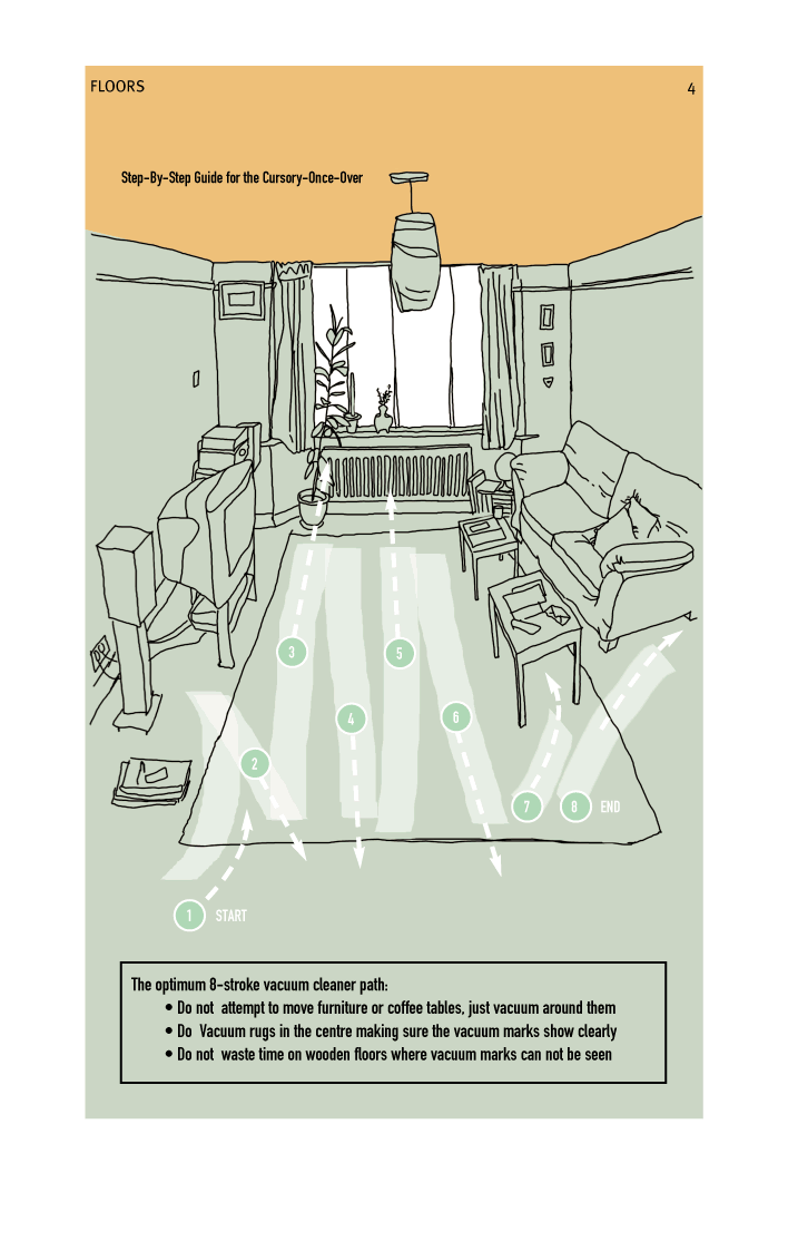
Do you cringe at the thought of having to clean your house for a mandatory party? Does a guest usually catch you off guard while your house is a disaster? Are you a modern woman who doesn't have the time to make your residence look pristine every damn minute? Well, we have the artists' book for you. Jackie Batey's Anxious Homes is the perfect guide for anyone who wants to appear to be tidy. Each book is inkjet printed & bound with a simple signature pamphlet stitch. Presented in a matter-of-fact, domineering tone, you will learn how to create vacuum lines on a rug or carpet, how to clean the taps in your bathroom, & methods to hide your hosting anxiety. This guide will "give the impression of a clean house in under 20 minutes," but if you have less than that, there are also steps for those with 10 minutes or 3 minutes. Now is your chance to be the falsely confident host your mother was.

Friday, September 23, 2011

Center Paige: Fun Sun Facts

This month's artists' book, Fun Sun Facts, comes from FAU student Kiran Trivedi & may be the only student artists' book that has been purchased by the JCBA. Made for a summer artists' book class in 2005, Trivedi went above & beyond the class' requirements, making a box & 50 copies of his book. The pages of the book are bristol boards that were laser engraved and cut by a 40 watt, carbon dioxide laser. The pages are shaped like a ray of sun, held together by a metal post screw & contains slits, which allows the book to look like a full sun when opened. The book is housed in an acrylic box that is also laser engraved & laser cut.

This book lives up to its name. All of the nine pages contain cool (more like, hot) information about the sun. And since I'm a sucker for time & space, here are some fun sun facts in the book:

"The Sun is 4.5 billion years old! If you think 4.5 billion years as the length of a 12 inch ruler, then the time humans have existed wouldn't even be the width of the lines marking the inches." (Page 6)

"The northern lights, or aurora borealis, are moving, dancing curtains of light that occur in the night sky near the North Pole. The aurora is caused by energetic particles from the Sun." (Page 9)

I don't know if the facts influenced the shape of the book or if the idea of the shape came before the text was brought to Trivedi's mind, but Fun Sun Facts is the perfect example of joining form & contain. And here's a fun fact; Kiran means "rays of sun."

Monday, August 22, 2011

Center Paige: The Alphabet of Time

Jim Machacek & Sibyl Rubottom's The Alphabet of Time is their abecedarium involving different theories, thinkers, & symbols involving time & space. The book is accordion bound with a red cloth covered board. The images are letterpress printed on polymer plates & wood type along with collage, hand painting, marbling & silk screening. I enjoy how the book uses many techniques in order to convey the message of each letter. Every page is different in design & often contains layered printing in different typefaces & colors. My favorite pages particularly are "B" for its striking hand painting combined with inkjet transparent waves, "O" for the handsome drawing of the oak tree & "T" for the removable time cards printed with quotes (which include the lyrics to "Time-Warp" from The Rocky Horror Picture Show.)
A is for Astrolabe & Aristotle
B is for Black holes
C is for Clocks & Joseph Cornell
D is for Decay
E is for Evolution
F is for Fossil
G is for Greenwich Mean Time
H is for The Hubble
I is for Infinity
J is for The Julian Calendar
K is for Kronos
L is for Longevity
M is for Music, Moment, & Mozart
N is for Nocturnal
O is for Old Oak
P is for Marcel Proust
Q is for Quantum Theory
R is for Relativity
S is for Seasons
T is for Time
U is for Universal Time
V is for Vanitas
W is for Water Clock
X is for Expressionism
Y is for Year
Z is for Time Zone


*As you can see we have a new name for the "Artists' Book of the Month" segment. This was created by blog reader Jessica, so thank you Jessica & also Amy Letter for your suggestions.

Wednesday, July 27, 2011

New Name for Looky Lookie

Contempt for "Looky Lookie"
For the dozen of you who read the JCBA blog, you'll know that every month, I feature a book from the collection & that segment is called "Looky Lookie." I never thought that title was too clever or cute & those disdainful feelings grow more & more. So, dear blog readers, come up with a new title for the "artist book of the month" bit. Post it in the comment section & I'll choose the one I like the most. Maybe you'll win something, maybe you won't. I have to think of something for you to win first. But, fire away!

Tuesday, July 12, 2011

Looky Lookie: Space + Time

Space + Time is Ken Leslie's project where he marked off 52 equally spaced points from one place in his garden, then sitting in the same spot, shot a photo once a week facing each successive point & created a circular foldbook. The book is housed in a slipcase featuring a photo of the photos joined together. 

Last month's "Looky Lookie" section featured Shinsuke Minegishi's The Tale of Three Black Boxes, which was also a study in the relationship of time & space (I didn't realize this when I picked this month's featured artists' book. I must be watching too many episodes of The Universe.) While Minesgishi is way more subtle with its dealing of the subject, Leslie wanted to make it clear that space & time are clearly closely related, despite being completely opposite concepts. This is proven by his different sides, one marked space & the other marked time, but the photos appear to be the same: the same standing grounds but objects appearing at different moments of the year. 


On each side, Leslie studies one of the two concepts. On the space side, Leslie notes that the world comes full circle & references Magellan. Leslie notes that Magellan traveled around the world to end up where he began & Leslie stayed in one spot & ended where he began. On the time side, Leslie notes that his daughter & he perceive time differently. A year to his ten year old daughter is only 10% of her life, which seems like a long time, yet a year to Leslie is 2% of his life. That idea blew my mind! It does seem to me, that my year in Kindergarten felt like forever; but now, semesters fly by me. It makes me wonder, if humans are someday able to live 200, 300, or 500 years because of advancements in medical technology, would a year feel like a week? How can you build relationships with people hundreds of years younger than you if you feel like the trends, cultures, politics & people are whizzing by? Ultimately, time moves faster, but do we go anywhere?

Monday, June 13, 2011

Looky Lookie: The Tale of Three Black Boxes

Shinsuke Minegishi's The Tale of Three Black Boxes is made up of spare text juxtaposed with six engravings created by the artist. The six pages were sewn together with a black, paper wrap with a single signature pamphlet stitch (those who have taken our Book Arts 101 classes know what that is.) Along with the storybook, Minegishi included a companion case that includes the six prints from the engravings incorporated with colored woodcuts of windows where the engravings can be seen. These prints are textured because of multiple inkings.


The story of the family of black boxes is simple. They are outcast in an all white-boxed city, so the black boxes decide to explore the world, where they encounter various animals in numerous locations. The black boxes ultimately end up living on the moon. The story & images make the artificial & geometric stand out against the living & biological, which are two opposites that humans try to put together all the time (example, trees in the city.) This idea is explored further in the extra prints, when the engravings are seen through the "peek-holes," which are created out of unnatural shapes & objects. These "peek-holes" transcend time & space, as the boxes do in the story, yet the boxes are three-dimensional & cannot actually travel in time. Another contradiction.

Tuesday, May 17, 2011

Looky Lookie: Triumph eines Hosenverkäufers

Triumph eines Hosenverkäufers (Triumph of a Trousers Salesman) was created by Veronika Schäpers in 2002. It is an edition of 15 copies. The book contains inkjet text & images printed on clear polyethylene foil pages. The pages are held together with gum cords that also bend the cover. It is housed in a clear polycarbonate cover housed in a inflatable air-cushion with red titling on front & black titling on back, which is also housed in a white fleece bag.


The book is inspired by the text, which is a poem written by Heiko Michael Hartmann. When the book is first viewed, it looks like blurs of red & the text becomes lighter as you descend to read it. But, as you turn the first page, you realize that the red is a silhouette of two boxers fighting & the lines of the poems appear one at a time on each page. So, as you turn the page to read the text, you see the two boxers continue their bout. But what does boxing have to do with selling pants? The poem, which is in German, is in the salesman's point-of-view, who approaches the job as a boxing match.

Here is a rough translation of the poem:
Immediately after I 
stumbled into the ring unguarded
there was I have something for you
certainly you may
the sheer force of springy ropes pushed me
in the dressing-room I turned weak
rather than suspicious
my suggestion for outside I staggered
under the cuffs of his endless
concern to settle the score
I kept nodding keep going I thought
only the price kept me on my 
feeble legs just feel the 
high-quality material & the excellent
workmanship will look fabulous 
after some alterations
with my city shirt mustering
what strength I had left I whispered I'll take it
you have made the gong saved me
chosen well

Monday, April 11, 2011

Looky Lookie: Gay Myths

Gay Myths by Edward H. Hutchins is a catalog of misconceptions about gay people. The book contains twenty-four photocopied pages with four foldouts. It is hand-stitched with a black faux leather paper cover with a white title and pink triangle pasted on the front. The message is pretty simple: everyone in the LGBT community has heard these hurtful phrases. And I mean everyone. The phrases are juxtaposed with black and white images to emphasize the text. The gay myths are:

1. We deserve AIDS.
2. We molest children.
3. We hate straights.
4. God doesn't love us.
5. Equal rights are special rights.
6. We're not fit to serve.
7. It's just about sex.
8. It's just a phase.
9. You can pick us out.
10. We hate the opposite sex.
11. You don't know a gay person.
12. We all love opera.
13. We have no history.
14. We don't make good parents.
15. We all know one another.
16. We recruit.
17. It's our parents' fault.
18. We're not fit to teach.
19. We all have good taste.
20. We're "butch" or "femme."
21. We're not happy.
22. We want to change.
23. Our unions aren't sacred.
24. We're going to give up.
25. Bigotry doesn't hurt.

In the colophon, Hutchins states, "For all the marchers missed when the park service ran out of fingers & toes." This is a reference to the March on Washington, 1993, where organizers estimated in attendance  one million while the National Park Service estimated three hundred thousand.


Gay Myths is part of the copier art movement. JCBA has a huge number of copier art books, including the complete run of the International Society of Copier Artists Quarterlies. To read more about ISCA and copier art, click here.

Friday, March 11, 2011

Looky Lookie: Book 91

Book 91 (The String Book) by Keith A Smith is study of light, shadows, moment & sound. Every page of this wordless book contains a different geometric shape or design, which comes out of the way the strings & the hand-punched holes are placed. But, this book isn't just about each page; it's about the task of turning the pages. With every turn, you hear the rubbing of the linen thread against the pages & some are louder than others, visually & aurally. Shadows create new shapes with the turns as light glides through the holes and slices through the strings. A triangle can appear out of a single string.

Book 91 challenges the idea of a book. Although the mainstream thinking of a book means to contain words or a narrative, I believe a book only needs a beginning & an end. In Book 91, it feels like there is a string being pulled from the beginning to end, encountering other strings & collaborating with them. You can feel the tension of the stings, almost like building tension during in a plot.

For further reading & pictures, here's a link to Judith Klau's analysis of Book 91 at the JCBA website.

Thursday, February 10, 2011

Looky Lookie: Sudden Flutter & An Interview w/ Carol Todaro

Sudden Flutter by Carol Todaro is bound in the yotsume toji style within a spine made of hand-made paper coated with black sumi ink. The book can be opened & placed at the spine so that the pages can flutter like bird wings. The book was designed, printed & bound by Todaro. The image & text was created with Adobe Photoshop & printed with archival inks on coated Mylar using an Epson Stylus Color printer. The end sheets are hand drawn with sandpaper & the pages are hand-cut.

In this months' segment of "Looky Lookie," I also decided to include an interview that I conducted with Carol. She is a local artist & a dear friend of the Center & was happy to humor us. It will allow us a little insight on Sudden Flutter & Carol's life as an artist.

JCBA: First off, how do you feel Sudden Flutter relates to other pieces of yours?
Carol Todaro: Sudden Flutter is one of the first books that I made & it is a touchstone for me in the sense that it is my first use of a fundamental image that I've returned to in other work over the last decade. In two larger installation pieces, for example, I've used the image of pages-as-wings.

JCBA: Who or what influences you regarding the content, the materials & the techniques that you use for your pieces?
CT: Many teachers have influenced me, from high school forward: Donald Saff had a profound influence on me in graduate school. Keith Smith was the first book artist that focused my attention to the genre & his books were my first teachers in book arts. Buzz Spector is another book-influence, through his writings & his work.

JCBA: What is your schooling background?
CT: I have an MFA in drawing & printmaking from the University of South Florida.

JCBA: What are your current projects?
CT: I'm starting a new collaborative piece with Peter Borrebach that will be on view during "O, Miami," the city's new poetry festival, in April this year. It's a piece made for the second-floor window space at Art Center/South Florida on Lincoln Road in Miami Beach.

JCBA: Besides that project, what are your extracurricular artistic activities?
CT: I'm married to an artist, Tom Lopez, & when we travel we make art, teach art seminars & see exhibitions. I teach at New World School of the Arts. I write, mostly poetry & belong to the Miami Poetry Collective.

JCBA: Since we like to stretch the definition of the book here at the JCBA, what is your definition of a book?
CT: My definition of a book is the very specific & traditional bound volume. Artists' books riff on all of the given physical & conceptual qualities of books & therefore an artists' book can be anything that refers back to those qualities. I like Johanna Drucker's direction, that artists who make books should "interrogate" every part of the book in order to tease out new ideas.

JCBA: With new technology, like the Kindle or the eReader, what do you think is in store for the book format?
CT: I don't know, but here are some thoughts on the topic:
Artists made digital forms of artists' books a part of the genre years ago. Books made for the screen & desktop printer have, in many ways (not all), fulfilled the promise of the artists' book as a democratic multiple.
I've seen a couple of articles recently (one in the New York Times magazine) about books as interior decoration, which I find depressing. I'd hate to see books become nostalgic collectibles. Books are inert without their content, whether that content is carried on pages or embedded in the object as a work of art.
What's evolving right now is a relationship between print media & digital media & I think that's where we need to focus our attention. It seems that publishing as an industry will be most profoundly changed by wide spread screen-reading. One question: how will the end of trade editions (if it comes to that) affect other forms of book production? It seems that small presses can do what they've always done. Is it possible that some materials & products (ink & paper?) will become dear if they are no longer used by mass media? We can make them from scratch, too!

JCBA: Finally, what advice can you give to aspiring book artists (besides "get out while you can?")
CT: My advice is just the opposite, to all artists: make a book. Artists' books are great companions to other art forms, allowing artist to open their processes & expand the line of inquiry. If an artist approached making a book not as a collection of images, but as an image itself, a thing complete, a time-based piece, it can change her work in profound way.

Thank you again, Carol, giving us some little tid-bits & don't forget to check out Carol's work at the art Center/ South Florida this April during "O, Miami."

Thursday, January 20, 2011

Looky Lookie: Soap Story

Angela Lorenz's Soap Story reads like a fairy tale (or soap opera.) It takes place in the 1950's in Calabria, Italy, where Donna Teresa, a woman with her own private washing area, confronts a young woman who is using her canal, only to find out that the woman is a struggling, single mother, whose luck is about to change. Lorenz claims that the tale is a true story told to her by the granddaughter of Donna Teresa.

Lorenz has created a piece of work that requires a lot of interaction from the audience. When the book is originally purchased, you receive a boxed, empty six paged album & six bars of soap. Do you see where this is heading? In order to get the pages, you must use each bar where the silk-screened linen pages reside. They must be dried out & placed in the numbered page that was stamped on the soap. So you have to ask yourself: do I keep the bars of soap or finish the book? Luckily, here at the Jaffe Center, we were able to get a finished copy of the book & the six bars of soap.

Lorenz must have been inspired by Willy Wonka & takes here book a step further. She utilizes the power of special edition & has a "golden ticket" hidden in one of the bars of soap. The receiver of the ticket wins a trip to Italy. Unfortunately, Lorenz has reported that no one has came forward, but she held a lottery for the prize & the curator of the special collection at Brown University's John Hay Library won the trip. Still, you never know; JCBA may have that special ticket hidden in one of our six bars of soap.

Lorenz has created a hands-on book that takes advantage of the process, the material & the editions. She has taken the story & ingrained every aspect of the story into the book. The pages look like rags, the book is bound in twine, the soap is wrapped in a reproduction of a woman's magazine, October 1956, titled "Mani di Fata" ("Hands of the Fairy") & the box the book comes in mimics an old soap box. Her endeavors creates an unified message.

You can also view Judith Klau's analysis of Soap Story, which features more photos of the book, at the JCBA website:  Soap Story

Thursday, December 16, 2010

Looky Lookie: Ghost Diary


Ghost Diary by Book Artist Maureen Cummins is based upon the handwritten letters of the Revolutionary colonel, Jonathan Rhea. Written to his children in 1807 on the anniversary of his wife's death, he documents his times as an officer. He goes into deep & violent details involving his service, which includes the burning of Indian villages, battles with the British & the killing of rebel insurgencies. In between these gruesome recollections, he recalls courting his wife, their time apart during the war, the birth of their children & his wife's struggle with a brain tumor.
The text is printed on glass plates and bound together with glass, vintage photo negatives, causing each copy of the book to be completely unique. The use of glass & the text impresses the fragility of life. It is a troubling look at how life can easily slip away. The Jaffe Center has number 11 of 25.