Thursday, December 29, 2011

Two-View Movie Review: The Triplets of Belleville

The Triplets of Belleville is a French animated film by Sylvain Chomet that follows a grandmother & her grandson, who has the dream of winning the Tour de France. During the race, a pair of blocky, suited men kidnaps the grandson. The grandmother & her dog follow the kidnappers all the way to Belleville, a grand metropolis at the other end of the ocean. In a unknown land, the pair get help from the Triplets of Belleville, an aged singing group from the 30's, now poor & left with eating frogs. They find out that the grandson was kidnapped by a mobster who created an underground gambling ring with bicyclists' endurance & life being bet on.


Chomet's film is highly artful & creative & he combined drawing & computer-imagery to created the very distinct & fluid nature of the characters. All the characters have their own physically tendencies & movements in which we get the characters' personalities from, since this is a dialogue free film. The characters talk in squeaks & squawks that are indiscernible, making this a universal film special for this global economy. That may be why it has become such a cult favorite. Anyone can pick it up & enjoy it. The film pokes fun of the French, by overly emphasizing their love of the Tour de France & frog legs, & America, by displaying the populous as being fat & loving hamburgers. It is also a worldwide hit probably because the film is funny, touching, & features some really great, stand-up-&-boogie music.

Thursday, December 22, 2011

Center Paige: Direction of the Road

Direction of the Road is a favorite among JCBA fans & employees. Science fiction & fantasy writer Ursula Le Guin wrote the story & artist Aaron Johnson constructed the book, box & images. The book is made out of over-beaten homemade linen paper & bound together in a long stitch. The text is letterpress printed & paper leave are pasted on every page. The book is held in a portfolio box & on the inside of the box's cover is a woodcut image. On the inside of the spine of the box is a tube covered with reflective polymer.

The story follows the life of an oak tree that lives in a field by a road. It has solitary life by the road with the exception of the occasional squirrel or bird. The tree also has a job to fulfill. It must grow larger as things get closer to it & smaller as things get further away. The tree can even grow larger on one side & smaller on the other as things travel down the road & the tree can do it in its sleep. The tree gets use to people traveling on horses & wagons, but soon notices loud, horseless wagons more & more. One of these high-speed cars caused the oak to leap in front of the car, causing the tree to make the decision to kill the driver. The tree was not happy about the mortal decision it had to make, but the driver didn't follow the North-South rules of the road. The tree had to kill him, but it is not a job that oaks are made for.

The whole story not only takes an interesting perspective, that of a tree, but also the way the tree sees the world is interesting. The tree sees itself the way we would see a tree. The tree grows bigger & smaller, or the tree moves slowly or at sixty miles per hour, depending on your ride. We also see the changes in the tree's world that come from changes in ours. The air smells, birds that travel to the tree lessen, & the tree gains new jobs. It not only has to provide shade to travelers, homes to animals, but also kill those who don't follow the rules.

Aaron Johnson took the story's unique POV & incorporated it with book. For one, the over-beaten pages make a rustling noise, much like that of leaves blowing in the wind. The leaves pasted on the pages turn green to brown as the story goes on, conveying life transitioning to death. But the most surprising & creative aspect of the book is the woodcut inside the box, which looks like a warped image of indistinct lines surrounding a circle. If you place the reflective tube on the circle, you realize that the woodcut is actually a warped image of a tree that has to be viewed on the tube & details like birds & a man sitting under the tree become clear. It is an anamorphic image, anamorphic meaning "to transform" in Greek, & is an art form first experimented with by Leonardo di Vinci.


Everything about Direction of the Road, from the box to the story to the art to the paper, is to convey & reiterate Le Guin & Johnson's themes. That is why is a favorite here at the center & new audience members always get a kick out of this book.

Wednesday, December 14, 2011

Graphic Novel of the Month: In the Shadow of No Towers

"Waiting for that other shoe to drop!" That is the theme for Art Spiegelman's first page of In the Shadow of No Towers & ultimately the theme of the whole book, which is Spiegelman's graphic essay about the anxiety & paranoia that came about after the 9/11 attacks on the Two Towers.  When open, the book is too be read length-wise & is newspaper sized. The 10-page book starts from Spiegelman's thoughts on the attacks to the coming year filled with odd politics & fear-mongering. Spiegelman claimed he created the book to get over his post-traumatic stress disorder caused by being in New York City during that tragic time.

The pages contain many of the characters from Spiegelman's other books & he will often randomly turn into a mouse, much like his highly popular & highly acclaimed book Maus. The glowing, ghostly frames of the towers are incorporated throughout the book. At the end of the book is a number of old comic strips that Spiegleman helped get him through creating the book, including The Yellow Kid & Little Nemo in Slumberland. In the Shadow of No Towers is a fine example of an artist working through his inner & outer demons.

Tuesday, December 13, 2011

Little Nemo Animation

I found this short animation clip of Little Nemo in Slumberland by Windsor McCay. The fluidity of the movements is incredible & it notes McCay's amazing detail to lines & transitions. This was made in 1910, which happens to be 18 years before Walt Disney's Steamboat Willie, if that helps put it in perspective. Animation has came a long way, but this is still pretty impressive.

Thursday, December 8, 2011

"Shut Up, Paige Turner": 3-D Movies

I went to see Hugo this weekend (great film, by the way) & I was set on not watching that movie in 3-D, which was hard because the only movie theater within a 15 mile radius had only two showings of the "2-D" version on Saturday. Every other theater had the 3-D version of the film, which I will not support & here are my reasons why.

For me, the 3-D image doesn't add anything to my movie experience. If anything, it takes away from it. I feel less immersed in the cinematic world because I'm aware that I'm in a theater. The best part about a film is getting sucked in, but with digital images flying at my face & pictures that look like I'm looking through a tunnel book, I fully aware that I'm in a moldy theater seat. For them to be called 3-D films & 2-D films is faulty. Films have always been in three dimensions. They've always contained depth & texture & we were watching movies just fine before 3-D came along.


There is something to be said about the flatness of the screen. It allows us to view the depth of the real world, but the picture's flatness allows us to get more involved in the narration, otherwise, it would be like seeing a play, where you're more aware of the reality of the real world. Psychologist Hugo Münsterberg wrote in 1916 about the pros of film's flatness. "We want to keep the interest in the plastic world & want to be aware of the depth in which the persons move, but our direct object of perception must be without the depth. That idea of space which forces on us most strongly the idea of heaviness, solidity & substantiality must be replaced by the light flitting immateriality." This flatness is a plus, not something that needs to change.

Good Movies Always Come in 3-D
Also, I don't like they way it alters the picture. The projectors for 3-D movies have to be dimmer for 3-D projectors & changing a 3-D projector to a 2-D projector requires a specialist to come to the theater, which cost thousands of dollars, so the theaters just keep them at their 3-D setting, making all films dimmer. Remember the time when the film could light up everyone's face in the theater, now it's a glow. Check it out next time you're at the movies.

Also, it's just another way for the studios to get extra money out of you, particularly if they're cheaply made 3-D films or animated films. Films like Avator or Hugo were shot with a 3-D camera that is highly technical & thus, highly expensive, making the hiked price a little understandable, but only a little. But for old 3-D films & newer films like Clash of the Titans, the film is sent overseas to digitally cut the film and layer it. That's why those films look like a science project diorama. You're paying for a poor product. As for animated movies, all they have to do is change a code, which is why all the animated blockbusters now are in 3-D, because it cost no extra money to make them that way.

You can keep on going to 3-D movies & I won't judge you, just do some research before you see a film & decide if the extra cash is worth it. But I will say this, if you badly need physical reality for your stories, go to a play & if you really want motion-sickness & objects flying at your face, go on a roller coaster.

Wednesday, November 30, 2011

The End of Lawrence & Julie & Julia

My favorite meta-text has ended today. The Lawrence & Julie & Julia Project is a blog about a movie about book about a blog about a book, where Lawrence Dai, a film studies student watched the movie Julie & Julia every day for a year & wrote a blog post every day. What seems like a stupid, pointless project turned into a study in the film process, which includes everything from editing to the title font. One of my favorite segments is Random Actor Tuesday, where he features a supporting character that say one or two lines. I wonder, after a year of having to watch a film, which Lawrence calculated to equaling a month of his waking life, what do you do when the you don't have to push play anymore?

Tuesday, November 29, 2011

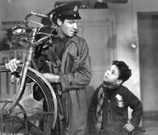
Two View Movie Review: Ladri di biciclette (The Bicycle Thieves)

Taking place in the bombed-out & depleted post-W.W.II Rome, Ladri di biciclette follows Antonio Ricci, an unemployed husband & father of two, who receives a job pasting movie posters in the inner city, but the job requires a bicycle. Without a bike, Antonio's wife pawns of their bed sheets in order to buy one, because this job comes with overtime & allowance for the family, meaning the Ricci's will never have to worry about eating again. But, one his first day, Antonio gets his bicycle stolen & barely sees the thief. He goes to the police & gets no help from them. With his neighbors & Bruno, his son, Antonio searches high & low for the bicycle, which finding or not finding the bike could change the coarse of his life forever.

What can I say about the The Bicycle Thieves? Nothing, I guess. Time to go home.

Just kidding. The Bicycle Thieves is one of my favorite films & was highly acclaimed when released & is still considered the best Italian neorealist films & one of the best films ever. Italian neorealism came after W.W.II & received its name because the directors used real locations, not sets, & non-actors, which director Vittorio De Sica also did. The neorealist made their stories about the poor & working class & showed the tough mental & physical conditions that were affecting the people.

This came about when Europe was going through this big change after the War. People didn't know how to react to such an extreme situation & they were living life next to buildings that were falling apart & new buildings were being constructed. It probably seemed like there was no way to pick yourself up, causing severe psychological & moral questions to be placed.

Tuesday, November 22, 2011

Center Paige: A Line

A Line is a wood cut & linoleum cut story by Suyeon Kim about "a blind fisherman, his dog & the bond between them." The book was printed by Incline Press & bound in an accordion fold & features sixteen prints. Along with the book comes a simple signature pamphlet bound book with the colophon & the written narrative of the book.

The story follows a blind fisherman who uses a line to go out to sea & collect his nets, but a seagull steals the line. The fisherman's dog turns into a bird to take back the line, but as the bird releases the line, a gigantic fish steals the line. The fisherman transforms into a fish, just as the dog turned into a bird,  to reclaim the line, but a shark comes to eat him. The bird turns into a rock barrier to protect his friend. Reclaiming the line, the fish transforms into the dog & the rock barrier transforms into the fisherman, now with the line intact & a big fish in a net, a worthy prize to take home.

The story is about a fishing line, but also the lines that connect us, "lifelines & friendship lines & the inexorable line of narrative that makes a satisfying story" says Kim. The cut images are beautiful & well printed & the book is a worthy addition to the Jaffe Collection.

Monday, November 21, 2011

The Books of Occupy Wall Street

Everyone knows that the book & the written word is a powerful machine for ideas, otherwise there wouldn't be book burnings. "Life transforming ideas have always come to me through books"-Oliver Wendell Holmes, Jr. The protesters of the Occupy Wall Street movement is aware of this facts & have created a makeshift library for the protesters to read. The Art & Design faction of the protesters have even created an artists' book using protest signs. There is a blog for the library, where you can get up-to-date details or find out how to donate books to the library. Keep this library & movement going by showing your support, because nothing is going to change if we don't stand long & strong.

Tuesday, November 15, 2011

Graphic Novel of the Month: Tintin in Tibet


Boy adventurer & reporter Tintin gets a horrible premonition involving his good friend, Chang, and a plane crash in the Himalayas. When it turns out that his vision is true, Tintin and his allies, the graceless Captain Haddock & Tintin's white terrier, Snowy, head to the Himalayas in search of Chang. The locals make it clear that the mountains are dangerous & Captain Haddock repeatedly states that the trek is most likely fruitless, but Tintin won't stop until he finds his friend. The three get a guide, Tharkey, and three porters to help with the expedition, but the porters run when there are signs of the fabled yeti. At the plane crash site, Chang isn't anywhere to be found, but Tintin doesn't give up hope, as little clues lead to party further into the mountains, but they have to weather the cold, wind, & the abominable snowman.

Tintin in Tibet is the 20th book in the Tintin series created by the Belgian Hergé. It follows the Tintin trend created by Hergé: cartoony characters with realistic backgrounds, flat-coloring, international adventure, & slapstick humor, usually created by Haddock. Fans and critics of Tintin find Tibet to be Hergé's best work. Tintin has never been braver, & the same goes for the usually cowardly Haddock. This book also features one of the few times Tintin has ever cried in the series, who is usually an unshakable character.  There is a good deal of drama and drive in this book.

The personal history revolving around this book is interesting. Hergé was experiencing nervous breakdowns while going through a divorce from a marriage of twenty-five years & he was experiencing reoccurring dreams of nothing but white space. His therapist advised Hergé to quit the Tintin series, but Hergé sought out to finish his current story, which turned out to be therapeutic. Hergé set the story in the Himalayas to convey the lost & emptiness he feels during his dreams, making Tibet the most colorless book of the otherwise vibrant series. After he finished the book, Hergé's breakdowns lessened, he married his new wife that year, & he never experienced anymore dreams of white.

Wednesday, November 2, 2011

Patrick Gannon: Cut Paper Art

I've discovered an amazing paper artist, Patrick Gannon. He has aspirations to release a 12-Month Calendar for 2012, but he needs some help, so he opened up a Kickerstarter account in order to get his project rolling. If you donate just $30, you will get the calendar. Help him out, or just take a gander at his amazing skills.


Wednesday, October 26, 2011

Two View Movie Review: Dr. Strangelove, or How I Stopped Worrying & Learned to Love the Bomb

President Muffley
Set at the height of the Cold War, Dr. Strangelove begins when Air Force General & Commander of the Burpelson Air Force Base Jack Ripper (Sterling Hayden) orders all B-52 airplanes to enter the Soviet Union & bomb it with nuclear weapons. The order was given under a special code that would follow after the assassination of the President. But the President wasn't assassinated. General Ripper made the order out of fear that the Soviets were fluoridating the water supply. President Merkin Muffley (Peter Sellers) meets with General Buck Turgidson (George C. Scott) & other high ranking officers in the "War Room" to figure out a way to stop the apparently unstoppable planes while General Ripper's executive officer, Lionel Mandrake (also Peter Sellers) tries to persuade General Ripper to call out the abort orders, because they learn that if there is a nuclear strike on the Soviet Union, there is a automatic doomsday device to be released by the Soviets.

Group Captain Lionel Mandrake
If you ever want to see a film about the Cold War, this would be it. It perfectly satirizes those nerving years & comments on the ridiculousness of the situation, which is why this is such a great comedy. And since this is a Stanley Kubrick film, there are a lot of sexual undertones, despite there only being one female character in the whole film. The opening sequence features an airplane getting fueled up during flying (featuring phallic symbols), the reasoning behind General Ripper's paranoia (he claims fluoride makes him impotent), & the President & the officers' backing of Dr. Strangelove's post-nuclear war plans (in which 10 women to every man would live in mineshafts) are just some of the subtle sexuality featured.

Dr. Strangelove
Speaking of Dr. Strangelove, which is Peter Seller's third & most hilarious character in the film, he is the President's scientific advisor, as he was an ex-Nazi physicist. Crippled & suffering from alien hand syndrome, Dr. Strangelove accidentally calls the President "Mein Führer" on a number of occasions, & Strangelove's explanation of a polygamist's society is extremely funny. He takes pleasure in the fact that the Nazi's two worst enemies, the USA & the USSR, might end up destroying each other causing a Nazi paradise where only the strong survive in a hyper-sexual world.

Dr. Strangelove has aged very well & is still relevant today & is considered one of the best political satires, if not the best.

Monday, October 24, 2011

Cheese or Font

It's Monday morning & I'm sure most of you don't feel like doing any work right now, so if you feel like taking a break, trying your hand at Cheese or Font. It's pretty simple: you get a word & you have to figure out if it is a cheese or a font. If you think that sounds easy, it really is not.

Monday, October 17, 2011

Center Paige: Anxious Homes

Do you cringe at the thought of having to clean your house for a mandatory party? Does a guest usually catch you off guard while your house is a disaster? Are you a modern woman who doesn't have the time to make your residence look pristine every damn minute? Well, we have the artists' book for you. Jackie Batey's Anxious Homes is the perfect guide for anyone who wants to appear to be tidy. Each book is inkjet printed & bound with a simple signature pamphlet stitch. Presented in a matter-of-fact, domineering tone, you will learn how to create vacuum lines on a rug or carpet, how to clean the taps in your bathroom, & methods to hide your hosting anxiety. This guide will "give the impression of a clean house in under 20 minutes," but if you have less than that, there are also steps for those with 10 minutes or 3 minutes. Now is your chance to be the falsely confident host your mother was.

Wednesday, October 12, 2011

The Alternative Hair Show

Traveling the world is the avant-garde Alternative Hair Show. Created by Tony Rizzo to raise money for leukemia research after the death of his son, the show started in 1983 & has become more popular every year. The show highlights leading hairdressers & hair artists with a knack for offbeat & innovative hair designs. 


Tuesday, October 11, 2011

Graphic Novel of the Month: City of Glass

"It was a wrong number that started it all..." which is the line that starts City of Glass. In the graphic novel adaptation of Paul Auster's book of the same name, mystery writer Daniel Quinn gets a puzzling phone call asking for detective Paul Auster. After many nights for the same request, Quinn decides to play along & gets a case from Peter Stillman, a mentally abused man-child, & Stillman's wife & speech therapist, Victoria. They tell him that Stillman was locked in a dark closet for years by his father, Peter Stillman Sr., a professor who was seeking out the original language before the fall of man in the Garden of Eden. After serving time for child abuse, Peter Stillman Sr. is being released & the couple is worried that he may show up to get revenge, so they pay Auster (Quinn) to follow Stillman.

That is the overall narrative structure of the novel, but this is more than just a detective story. There is much to say about this novel & I wrote out five paragraphs of analysis with more on my mind, but I deleted it all. It's just too heavy of a novel to be discussed in a couple of statements. There are assertions & contradictions in the novel about identity, authorship, & semiotics, along with many visual themes & motifs. If I were to teach a class on comic theory (which may or may not be a class anywhere, sadly) I would have this as part of my required reading. I also didn't realize this, but City of Glass perfectly pairs up with last months G.N.o.t.M., Understanding Comics. I would recommend reading that one first, and then hit City of Glass. It will help you with the match shots & panel transitions that are fill the pages, making City of Glass quite cerebral & technical. 


To put it into perspective as too how much effort was put into this novel, it took four people to adapt it from a written novel to a graphic novel. Paul Karasik wrote the script, David Mazzucchelli drew it, Paul Auster supervised the adaption & Art Spieglman organized it. I haven't read the original, but as a work on its own, it is something of a revelation.

Tuesday, October 4, 2011

Letterpress Appreciation Day-Open House

For all of you JCBA fans, you'll know that September 18th is Letterpress Appreciation Day because the standard height for wood and type is .0918, hence 09/18. We had our second annual Open House for Letterpress Appreciation Day & guest were able to use the our cast iron Washington Press to make a broadside with the quote "Don't Forget to Live Today." Also, our Vandercook Press was up & running as guest were able to print our 19th Century image of a flying time machine that we've been using since Arthur's birthday. Attendance was good; some say we had close to hundred people, & some say a couple of hundred. We lost track after eleven. If you weren't able to make it this year, mark your calendars, because this will be an annual event. It's free and fun for all.

Wednesday, September 28, 2011

Two View Movie Review: Spirited Away

In this animated fantasy-adventure film, ten year-old Chihiro whines & complains to her parents about their move to a new home. On their way to their home, they come across an abandoned amusement park. While walking through the park, they see some deserted food, & to Chihiro disdain, her parents start to feast on it. Wandering the park, Chihiro spots a grand bathhouse; but, at nightfall, spirits start to appear in the park. She runs back to her parents, only to find them turned into pigs. A boy named Haku finds Chihiro & tells her that the place is a bathhouse for spirits & demons. In order for her to stay alive, she must get employment from the bathhouse's manager, the witch Yubaba. While working at the bathhouse, Chihiro comes across many ancient creatures, including Kamaji, the six-armed boiler room worker; No-Face, an empathetic wraith that feeds off the emotions of others; & a stink spirit, the worst customer to ever enter the bathhouse.

Spirited Away is my personal favorite Hayao Miyazaki film, who some would say overthrows Walt Disney as the supreme animator. Miyazaki presents to us a frighten & fussy girl who is forced into another reality & must learn to use the resources around her in order to survive. There was a moment in the film when I realized that Chihiro grew up at a point when she bravely trekked across a water pipe that was outside & overlooking a cliff. Earlier in the film, she was had trouble just climbing down some steep stairs. The film belongs next to other fantasy, coming-of-age stories like Alice's Adventure in Wonderland & Pinocchio. 

Besides following a liminal progression, Spirited Away contains many themes often seen in Miyazaki's films, which includes pollution (symbolized in the stink spirit), greed & gluttony (symbolized in Chihiro's parents), & the losing of customs & cultures in a global society. The later is a major point in the film, as Chihiro is isolated from the outside world & comes face-to-face with Japanese mythological creatures. And there are many Japanese symbols & customs shown in the film that may make it hard to follow for non-Japanese, but that is kind of the point. Chihiro doesn't understand most of it either, showing a decline in traditions.

This is great family film, as adults will be able to catch the social commentary & the weird creatures & action sequences will transfix the kids. Plus, anyone can enjoy it for its imaginative images & animation. It's just awesome.

Friday, September 23, 2011

Center Paige: Fun Sun Facts

This month's artists' book, Fun Sun Facts, comes from FAU student Kiran Trivedi & may be the only student artists' book that has been purchased by the JCBA. Made for a summer artists' book class in 2005, Trivedi went above & beyond the class' requirements, making a box & 50 copies of his book. The pages of the book are bristol boards that were laser engraved and cut by a 40 watt, carbon dioxide laser. The pages are shaped like a ray of sun, held together by a metal post screw & contains slits, which allows the book to look like a full sun when opened. The book is housed in an acrylic box that is also laser engraved & laser cut.

This book lives up to its name. All of the nine pages contain cool (more like, hot) information about the sun. And since I'm a sucker for time & space, here are some fun sun facts in the book:

"The Sun is 4.5 billion years old! If you think 4.5 billion years as the length of a 12 inch ruler, then the time humans have existed wouldn't even be the width of the lines marking the inches." (Page 6)

"The northern lights, or aurora borealis, are moving, dancing curtains of light that occur in the night sky near the North Pole. The aurora is caused by energetic particles from the Sun." (Page 9)

I don't know if the facts influenced the shape of the book or if the idea of the shape came before the text was brought to Trivedi's mind, but Fun Sun Facts is the perfect example of joining form & contain. And here's a fun fact; Kiran means "rays of sun."

Wednesday, September 21, 2011

The History of English in Ten Minutes

The Open University released on Youtube a funny & informative animated series about the English language. All the chapters speak of certain events in history that have transformed the way we speak, starting with the Germanic tribes entering Britain all the way to the Internet age. These are some of my favorite chapters.


Monday, September 19, 2011

Sapling Press & Dear Blank, Please Blank

I came across some hilarious letterpress cards creating by Sapling Press with the text being from the snarky website Dear Blank, Please Blank, where anyone can post their short letter, usually just to get something off their chest. Here are my favorites.


Tuesday, September 13, 2011

Graphic Novel of the Month: Understanding Comics

Scott McCloud is a comic book writer & artist who experienced some minor fame & success with runs on various comics & with his own creation ZOT!, in 1993, McCloud decided to break out of fiction & try to theorize the confusing & misunderstood comic book. Understanding Comics: The Invisible Art was his graphic novel where he defined the comic & its vocabulary, gave its history & theorized the various elements of the comic & their uses. It was a groundbreaking graphic novel because it was comic theory in comic form. Most comic theory books before this were text-based, but McCloud wanted to emphasize the power of the medium.

This graphic novel does have its controversy, especially when McCloud defines the comic & what he considers art. His definition of art includes "any human activity that doesn't grow out of our species' two basic instincts: survival & reproduction." This definition opens a whole can of worms that many will find engrossing. Still, McCloud realizes that he theories are just that & hopes that this novel will open up a debate.


McCloud makes the novel fun to read & look at. He draws himself & the panels as simple as needed, but shows off his drawing muscle from time-to-time for examples. As much as he tries to make it digestible, there is a lot of theory & thought in every page & is not a read-in-one-setting kind of book. This one requires a couple of reads in order for you to retain a good portion of the details. Still, I highly recommend this book for comic lovers, art lovers, & book lovers (so pretty much everyone), as it will change the way you look at comics forever.